Appointments Dashboard
The Appointments Dashboard gives you a single view of how your appointment funnel is performing — how much business you're booking, how much of it converts to paid work, where the bookings come from, and how your recommended services are landing with customers.
This article explains every tile on the dashboard: what it shows, why it matters, and exactly how the number is calculated.
Getting around the dashboard
Choosing a time period
A period selector sits at the top of the dashboard. It controls every tile at once. The default is Past 30 Days. You can choose ranges like Past 7 / 14 / 30 / 60 Days, Past 3 / 6 Months, Past Year, This/Last Week, This/Last Month, This/Last Quarter, This/Last Year, and All Time.

Trend arrows (vs. prior period)
Many tiles show a small up/down percentage. This compares the period you selected against the immediately preceding period of the same length (e.g. Past 30 Days compares to the 30 days before that). Longer periods automatically compare week-over-week, month-over-month, or year-over-year so the comparison stays meaningful.
The "Transaction" badge and POS/SMS connection
Several tiles rely on point-of-sale or service-management-system (POS/SMS) transaction data. These are marked with a transaction badge. If your POS/SMS isn't connected, those tiles show a locked/empty state and prompt you to connect it. Revenue and conversion figures only appear once real transactions can be matched to appointments.
Booking date vs. service date. Most revenue and conversion metrics are measured by the date the work actually happened (the service/transaction date), while booking-count metrics are measured by the date the appointment was created. This is why a revenue number and a booking-count number for "the same period" can describe slightly different appointments.
Tiles
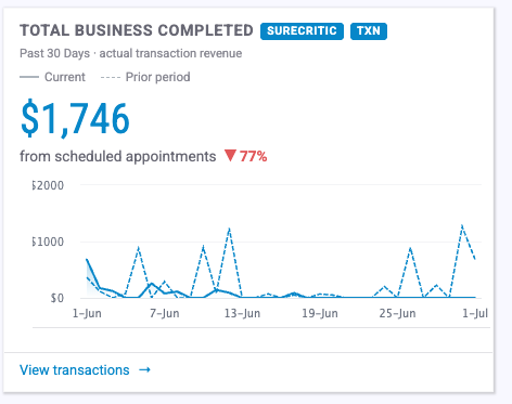
1. Total Business Completed
What it shows: Actual POS/SMS transaction revenue tied to your scheduled appointments for the period.
Goal: Tells you the real dollars your booked appointments produced — the headline "money in the door" number for the dashboard.
How it's calculated: Sum of attributed transaction revenue ( revenue_o_cents), totaled by service date and converted from cents to dollars. Requires a connected POS/SMS. Shows a day-over-day trend vs. the prior period.
2. Appointment Conversion
What it shows: The share of appointments that turned into a paid transaction.
Goal: Measures how effectively booked appointments become completed, paid work. The target is 80% — below that, the tile shows a "Below target" warning.
How it's calculated: Conversion % = matched transactions ÷ active appointments (active appointments = appointments booked − cancelled − no-shows)
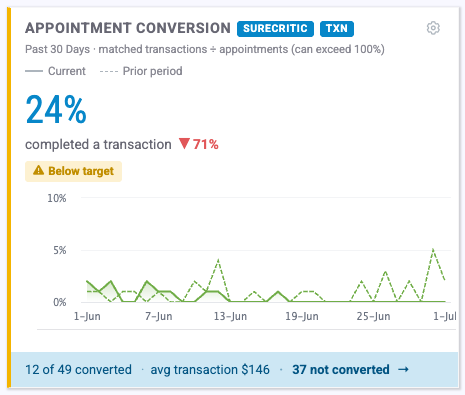
Cancellations and no-shows are removed from the denominator so they don't unfairly drag the rate down (they're tracked on their own). Because a single appointment can generate more than one transaction, this rate can exceed 100%. Requires a connected POS/SMS. Footer shows converted count, average transaction amount, and a drill-down to unconverted appointments.
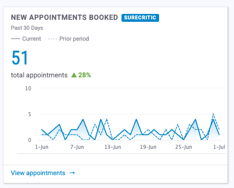
3. New Appointments Booked
What it shows: The total number of new appointments created during the period.
Goal: A pure top-of-funnel volume measure — how much demand you're capturing, regardless of outcome or revenue.
How it's calculated: Count of appointments ( appointments_o) within the date range. No POS/SMS required. Shows a percent-change trend vs. the prior period and links to the filtered appointments list.
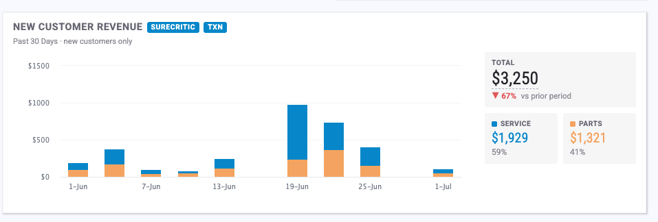
4. New Customer Revenue
What it shows: Revenue from first-time customers only, split into Service (labor) and Parts as a stacked bar over time.
Goal: Isolates the revenue you're earning from newly acquired customers, so you can see whether new-customer acquisition is actually paying off.
How it's calculated: Sums new_customer_revenue_labor_cents (Service) and new_customer_revenue_parts_cents (Parts) by day, then groups the days into chart columns. The labor/parts split is shown for automotive businesses; other industries see a single total. Requires a connected POS/SMS. Trend compares total new-customer revenue vs. the prior period.
5. Appointment Source
What it shows: Where your appointments came from — Unknown, Email, Google, Social, and Campaigns — viewable by count or by revenue.
Goal: Shows which channels actually drive bookings (and dollars), so you can judge where your marketing effort is paying off.
How it's calculated:
- Count mode: Sums the per-source columns (
unknown_source_o,email_source_o,google_source_o,social_source_o,campaigns_source_o) over the period. - Revenue mode: For each day, that day's attributed revenue is split across sources in proportion to each source's share of that day's appointments, then summed. Revenue mode requires a connected POS/SMS; count mode is always available.
 Source Configuration: Scheduler Configuration>Campaign Sources

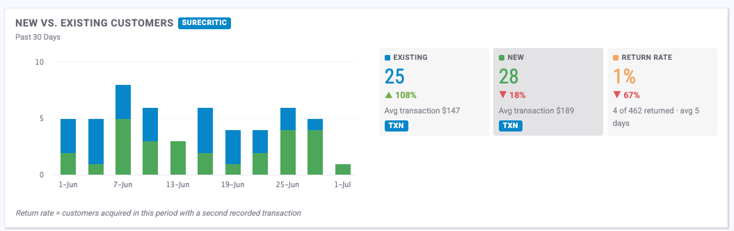
6. New vs. Existing Customers (Customer Mix)
What it shows: Three summary cards — Existing Customers, New Customers, and Return Rate — plus a stacked daily column chart.
Goal: Shows the balance of new acquisition vs. repeat business, and how well you're turning new customers into returning ones.
How it's calculated:
- Existing / New Customers: Counts of
existing_customers_oandnew_customers_oappointments, with each card's average ticket shown in the footer. - Return Rate: Of the customers acquired during this period, the percentage who came back for a second transaction. The footer also shows the average number of days between a customer's first and second visit. (Average ticket and return rate require a connected POS/SMS.)
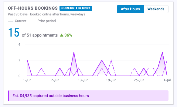
7. Off-Hours Bookings
What it shows: How many appointments were booked outside normal business hours, with a toggle between After Hours (weekday evenings) and Weekends.
Goal: Quantifies demand that arrives when your front desk is closed — business you'd miss without online/automated booking. A yellow callout estimates the revenue those bookings represent.
H ow it's calculated: Sums after_hours_bookings_o or weekend_bookings_o (depending on the toggle) over the period, shown as "X of Y" total appointments. The revenue estimate multiplies the off-hours count by your average ticket. The revenue callout only appears when a connected POS/SMS provides a real average ticket.
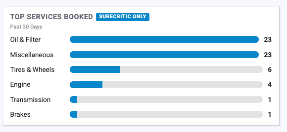
8. Top Services Booked
What it shows: Your most-booked service categories, as a horizontal bar chart (top 6).
Goal: Shows what customers are actually coming in for, so you can staff, stock, and market around real demand.
How it's calculated: Counts booked appointments grouped by service category over the period, ranked highest-to-lowest, limited to the top 6. No POS/SMS required.
Recommended Services
These tiles measure how your recommended / suggested services (upsells and add-ons offered to customers) are performing. Service Recommendations must be turned on:
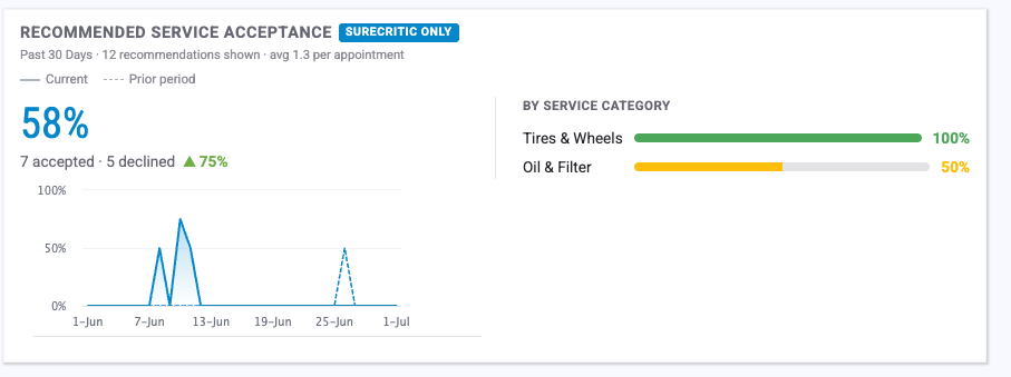
9. Recommended Service Acceptance
What it shows: The overall acceptance rate of recommended services, the number of recommendations shown, the average number shown per appointment, and a breakdown of acceptance by service category.
Goal: Tells you how persuasive your service recommendations are and which categories customers say "yes" to most often.
How it's calculated:
- Acceptance % = recommendations accepted ÷ recommendations shown
- Avg per appointment = recommendations shown ÷ appointments that received a recommendation Categories are ranked by acceptance rate (top categories shown). The trend line compares acceptance rate against the prior period. No POS/SMS required — based on recommendation offer records.
Categories are ranked by acceptance rate (top categories shown). The trend line compares acceptance rate against the prior period. No POS/SMS required — based on recommendation offer records.
10. Upsell Revenue
What it shows: The quoted value of recommended services that customers accepted.
Goal: Puts a dollar figure on your recommendation program — the additional revenue generated by upsells and add-ons.
How it's calculated: Sum of upsell_revenue_o_cents (accepted recommendation value) over the period, in dollars. The footer shows the average upsell per appointment and upsell revenue as a percent of total revenue. Requires a connected POS/SMS.
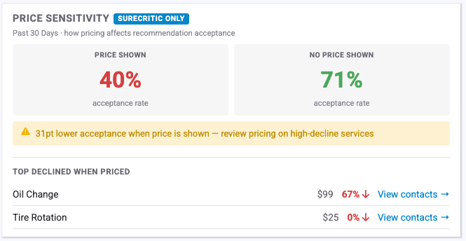
11. Price Sensitivity
What it shows: Recommendation acceptance rate with a price displayed vs. without a price displayed, plus the services most often declined when a price was shown.
Goal: Reveals how showing a price affects whether customers accept a recommendation — useful for deciding when to surface pricing.
How it's calculated: Acceptance rate (accepted ÷ shown) calculated separately for offers that displayed a price and offers that didn't. A yellow callout appears when the no-price acceptance rate beats the with-price rate by 10 percentage points or more, flagging that pricing may be costing you acceptances. Top declined services are ranked by decline rate among price-shown offers. No POS/SMS required.
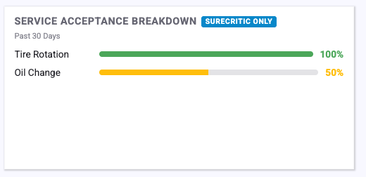
12. Service Acceptance Breakdown
What it shows: Acceptance rate for each individual service (not category), as a ranked horizontal bar chart (top 10, collapsible).
Goal: A service-level companion to tile #9 — shows precisely which services customers accept or decline so you can refine what you recommend.
How it's calculated: Acceptance rate (accepted ÷ shown) per service, sorted highest-to-lowest. No POS/SMS required.
Quick reference
| Tile | Measures | Needs POS/SMS? | Has a target? |
|---|---|---|---|
| Total Business Completed | Attributed transaction revenue | Yes | — |
| Appointment Conversion | Transactions ÷ active appointments | Yes | 80% |
| New Appointments Booked | Count of new appointments | No | — |
| New Customer Revenue | New-customer revenue (service + parts) | Yes | — |
| Appointment Source | Bookings/revenue by channel | Count: No Revenue: Yes | — |
| New vs. Existing Customers | Customer mix + return rate | Mix: No Ticket/Return: Yes | — |
| Off-Hours Bookings | After-hours / weekend bookings | Count: No Revenue est: Yes | — |
| Top Services Booked | Most-booked service categories | No | — |
| Recommended Service Acceptance | Recommendation acceptance rate | No | — |
| Upsell Revenue | Accepted recommendation value | Yes | — |
| Price Sensitivity | Acceptance with vs. without price | No | 10-pt gap alert |
| Service Acceptance Breakdown | Per-service acceptance rate | No | — |
Tip: If a revenue or conversion tile looks empty, confirm your POS/SMS is connected and that transaction data has synced for the selected period.